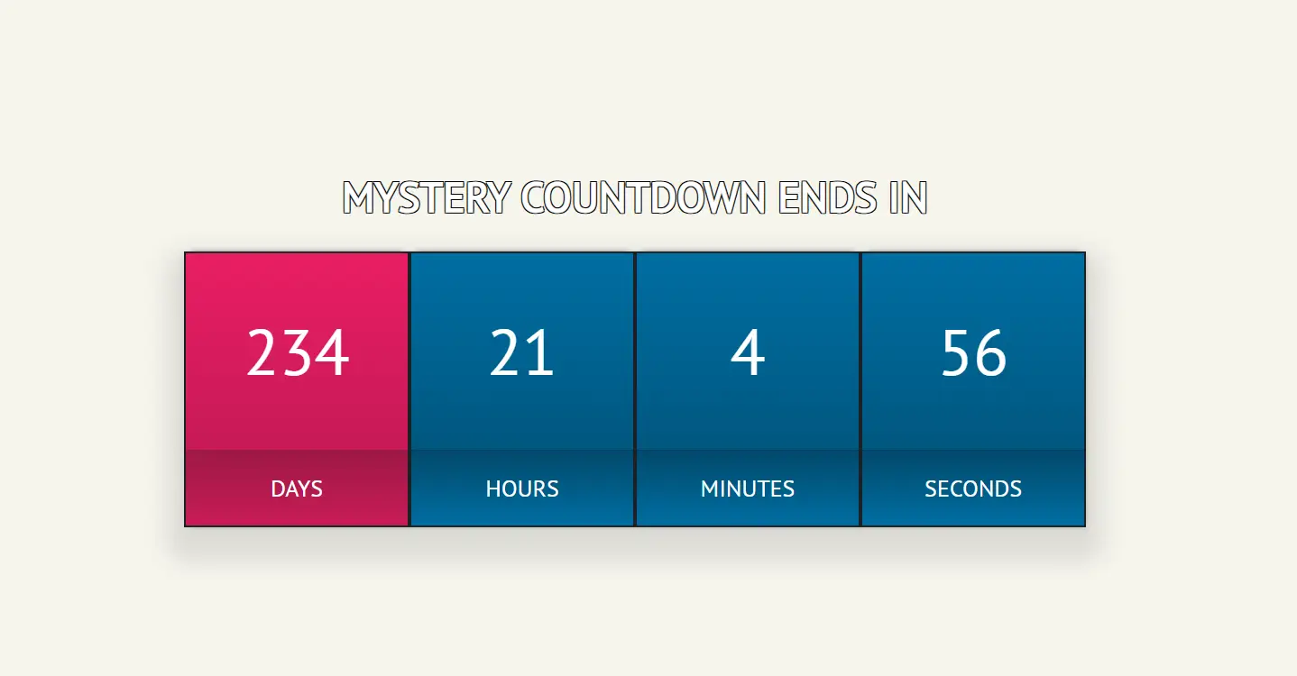
Inspired by Jake Archibald’s countdown gist and his video walkthrough, this project reimagines the classic countdown timer with a modern, responsive, and inclusive twist.
Whether you’re teasing a product launch, counting down to a special event, or just love the thrill of anticipation, a countdown timer adds excitement and urgency to any webpage. In this post, I’ll walk you through how I built a responsive and accessible countdown timer using vanilla HTML, CSS, and JavaScript.
The Concept
I wanted something more than just ticking numbers. My goals:
- Responsive design that looks great on any screen
- Accessibility features for screen readers
- A celebratory message when the countdown ends
And of course, it had to be stylish. Because why settle for boring?
The HTML Structure
The timer is broken into four columns: days, hours, minutes, and seconds. Each unit is wrapped in a semantic container with aria-labels for screen reader support:
<div class="clock-container" role="group" aria-label="Countdown timer">
  <div class="clock-col">
    <div id="days" class="clock-days clock-timer" aria-label="Days remaining"> </div>
    <div class="clock-label label-days">Days</div>
  </div>
  <div class="clock-col">
    <div id="hours" class="clock-hours clock-timer" aria-label="Hours remaining"> </div>
    <div class="clock-label label-hour">Hours</div>
  </div>
  <div class="clock-col">
    <div id="minutes" class="clock-minutes clock-timer" aria-label="Minutes remaining"> </div>
    <div class="clock-label label-minutes">Minutes</div>
  </div>
  <div class="clock-col">
    <div id="seconds" class="clock-seconds clock-timer" aria-label="Seconds remaining"> </div>
    <div class="clock-label label-seconds">Seconds</div>
  </div>
</div>
Styling with Sass-like CSS
I used nested selectors to keep things organized and added gradients, shadows, and responsive tweaks. The timer digits scale slightly when updated, giving a subtle animation effect:
.clock {
  margin: 1rem auto;

  &-container {
    border-radius: 5px;
    box-shadow: 1px 1px 5px rgba(0, 0, 0, 0.1),
      0 15px 20px 15px rgba(0, 0, 0, 0.1);
    width: 90%;
    max-width: 800px;
    display: flex;
    flex-wrap: wrap;

    @media screen and (max-width: 600px) {
      max-width: 320px;
    }
  }
  &-col {
    flex: 25%;
    max-width: 200px;
    text-align: center;
    border: 2px solid #1a2026;
    background: #006ea2;
    background: linear-gradient(
      180deg,
      rgba(0, 110, 162, 1) 0%,
      rgba(1, 78, 115, 1) 100%
    );

    @media screen and (max-width: 600px) {
      flex: 50%;
    }
    &:first-child {
      background: #e91e63;
      background: linear-gradient(
        180deg,
        rgba(233, 30, 99, 1) 0%,
        rgba(185, 24, 82, 1) 100%
      );
    }
  }
  &-timer {
    font-size: 3.6rem;
    padding: 50px 0;
    box-shadow: 0 -5px 5px -5px #333;
  }

  &-label {
    text-transform: uppercase;
    font-size: 1.3rem;
    padding: 20px 0;
    margin: 0;
    background: #006ea2;
    background: linear-gradient(
      180deg,
      rgba(2, 73, 107, 1) 0%,
      rgba(0, 110, 162, 1) 100%
    );
    border-top: 1px solid #013e5b;

    &.label-days {
      background: #e91e63;
      background: linear-gradient(
        0deg,
        rgba(201, 28, 87, 1) 0%,
        rgba(158, 24, 69, 1) 100%
      );
      border-top: 1px solid #a31847;
    }
  }
}

.expired-message {
  font-size: 2rem;
  color: white;
  margin: 10px auto;
}
JavaScript Logic
The countdown is powered by a custom animationInterval() function that syncs updates with the animation frame for smoother performance. I also optimized DOM updates by only changing the digits when their values change:
if (seconds !== prev.seconds) {
  clockSecondsElement.textContent = seconds;
  prev.seconds = seconds;
}
When the countdown hits zero, the timer stops and a celebratory message appears:
if (distance < 0) {
  controller.abort();
  document.querySelector(".clock-container").innerHTML = `
    <div class="expired-message">🎉 The mystery has been revealed!</div>
  `;
}
Accessibility Matters
I added aria-labels to each time unit and wrapped the timer in a role="group" for screen readers. This ensures users with assistive technologies can understand what each number represents.
Final Thoughts
This project was a fun blend of design, performance, and accessibility. If you want to customize it further, here are a few ideas:
- Add sound effects or voice announcements when the timer ends
- Turn it into a reusable component with custom end dates
- Animate the digits with a flip effect for extra flair
You can view the full code on CodePen or explore more of my work there.
Let me know what you’re counting down to—I’d love to hear it!

Leave a Reply