What is dark mode?
Dark mode is a tendency toward designing with a predominantly dark palette. Instead of using white or light-colored backgrounds, you use a black or dark background. As a consequence, text and icons are necessarily light to ensure they are visible.
Dark themes reduce the luminance emitted by device screens, while still meeting minimum color contrast ratios. They help improve visual ergonomics by reducing eye strain, adjusting brightness to current lighting conditions, and facilitating screen use in dark environments – all while conserving battery power. Devices with OLED screens benefit from the ability to turn off black pixels at any time of day.
When to use dark UIs
- When a branding color scheme warrants it
- When the design is sparse and minimalist with only a few content types
- When it is appropriate for the context and use, such as nighttime entertainment apps
- To reduce eye strain, such as analytics pages that are used for long periods
- To elicit an emotion—for example, a feeling of intrigue and mystery
- To create a striking, dramatic look
- To create a sense of luxury and prestige
- To support visual hierarchy
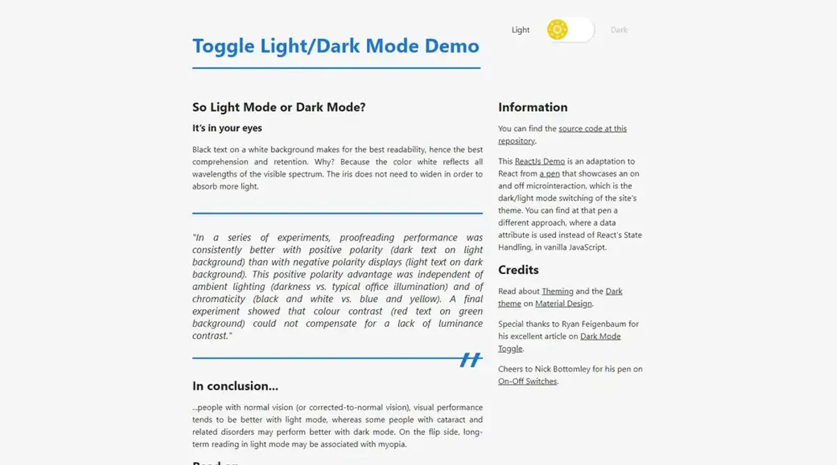
So Light Mode or Dark Mode?
It’s in your eyes
Black text on a white background makes for the best readability, hence the best comprehension and retention. Why? Because the color white reflects all wavelengths of the visible spectrum. The iris does not need to widen to absorb more light.
“In a series of experiments, proofreading performance was consistently better with positive polarity (dark text on light background) than with negative polarity displays (light text on dark background). This positive polarity advantage was independent of ambient lighting (darkness vs. typical office illumination) and of chromaticity (black and white vs. blue and yellow). A final experiment showed that colour contrast (red text on green background) could not compensate for a lack of luminance contrast.”
So how do you program such an interface?
With React
I have built a ReactJs demo, with the same concept. You can see it working here: Dark Mode Switcher Demo. You can also see the source code.
With Vanilla Javascript
I have built an alternative demo, which you can play with on CodePen, to showcase how you can work with it using Vanilla Javascript.
In conclusion…
…people with normal vision (or corrected-to-normal vision), visual performance tends to be better with light mode, whereas some people with cataract and related disorders may perform better with dark mode. On the flip side, long-term reading in light mode may be associated with myopia.
Credits
Read about Theming and the Dark theme in Material Design.
Special thanks to Ryan Feigenbaum for his excellent article on Dark Mode Toggle.
Cheers to Nick Bottomley for his pen on On-Off Switches.
Give me a shout!
If you’ve used it yourself or have another neat solution, please give me a shout!
Thank you and happy coding.
